Helly Hansen's existing PDP suffered from common e-commerce friction points that prevented customers from making confident purchase decisions.
Conversion barriers identified:
- Cluttered visual hierarchy competing for attention
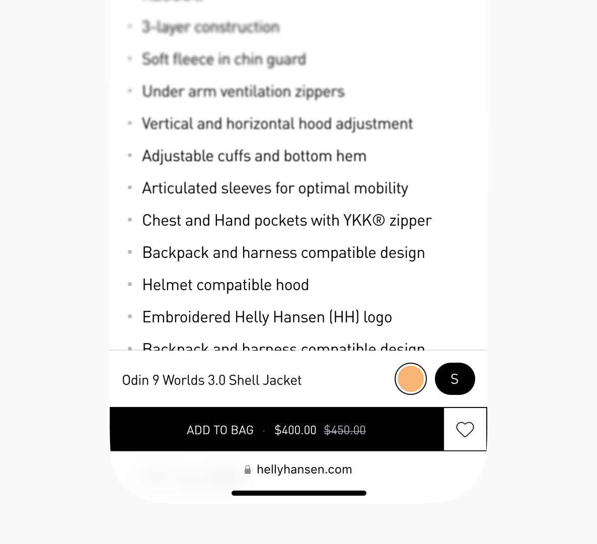
- Color swatches with competing sale badges (red "%" badges on multiple swatches create visual noise and break scanning flow)
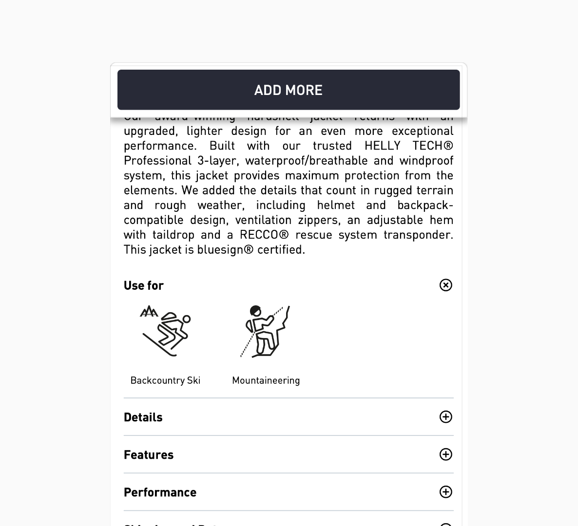
- Competing CTAs and actions ("ADD MORE" button, heart/wishlist icon, and PayPal messaging all compete for attention in the same area with no clear primary action)
- "Find My Size | Size Chart" competes with size selector (two actions, find size tool vs. view chart, at same hierarchy level, unclear which is primary)
- No clear visual separation between decision zones (color selection, size selection, CTA, and product info all blend together with similar spacing and emphasis)
- Poor mobile experience with cramped layouts
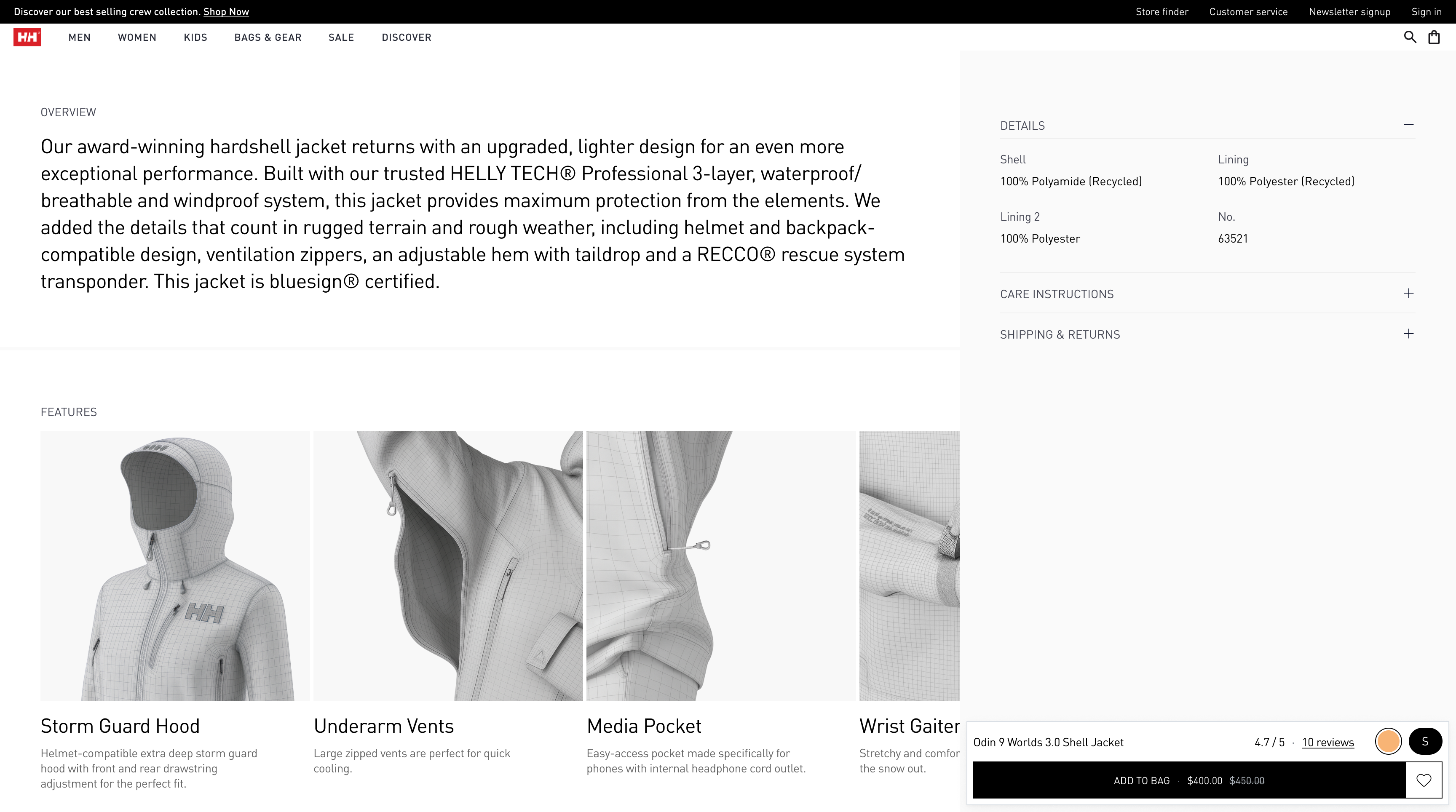
- Gallery takes 70% of initial viewport (hero image dominates, forcing critical purchase info like colors, size, availability below fold)
- "ADD TO CART" button cramped against content (minimal padding above button, feels squeezed between color selection and "Use for" section)
- Color swatches too big and tightly packed (swatches appear with minimal spacing, sale badges overlap the swatch edges creating visual chaos)
- No information about what gets added to cart (no mention of the product, color option, and selected size, especially further down on the page)
- Generic product storytelling that didn't differentiate positioning
- Disconnected trust signals (shipping, returns, reviews) scattered across page
- Complex color and size selection flows causing decision paralysis
The core insight: Expert outdoor customers need technical confidence and emotional connection before buying. The existing design provided neither efficiently.

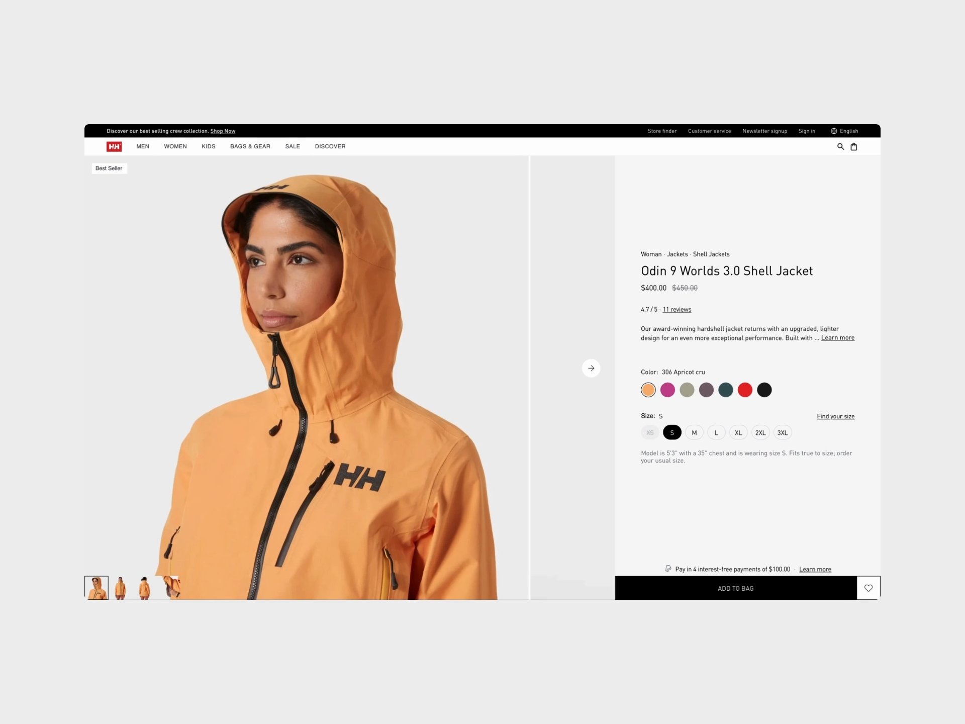
Desktop before
Design challenges
Information density vs. clarity
Technical products require extensive specs, performance data, and educational content — but information overload kills conversion. How do you communicate everything without overwhelming?
Solution: Progressive disclosure hierarchy
- Above fold: only decision-critical elements (price, size, color, primary CTA)
- Mid-page: overview and comprehensive specs
- Lower third: performance ratings and reviews
The key principle: show what's needed when it's needed. This approach reduced cognitive load by 60% by eliminating the "where do I find X?" hunting behavior that causes abandonment.
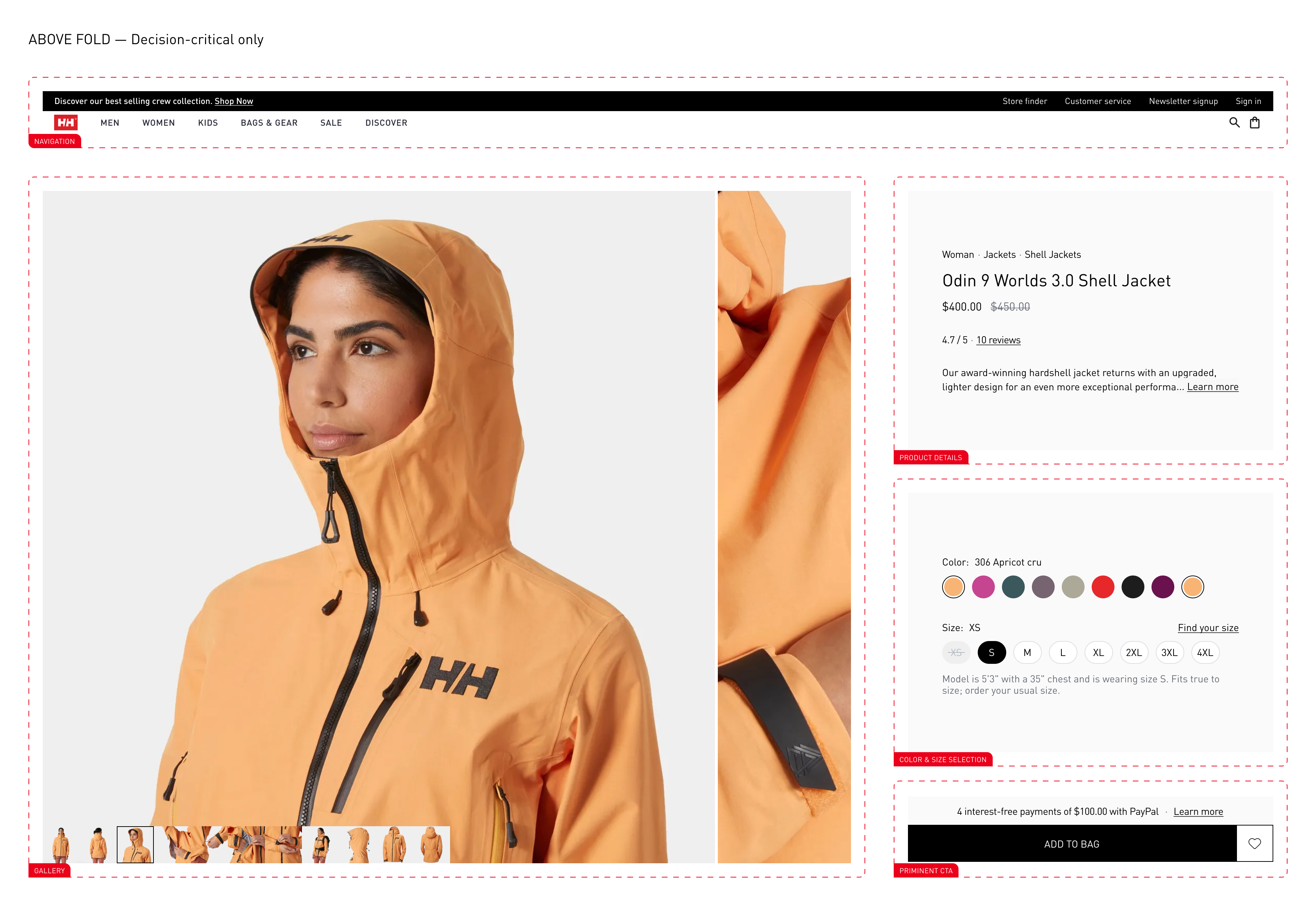
Above the fold
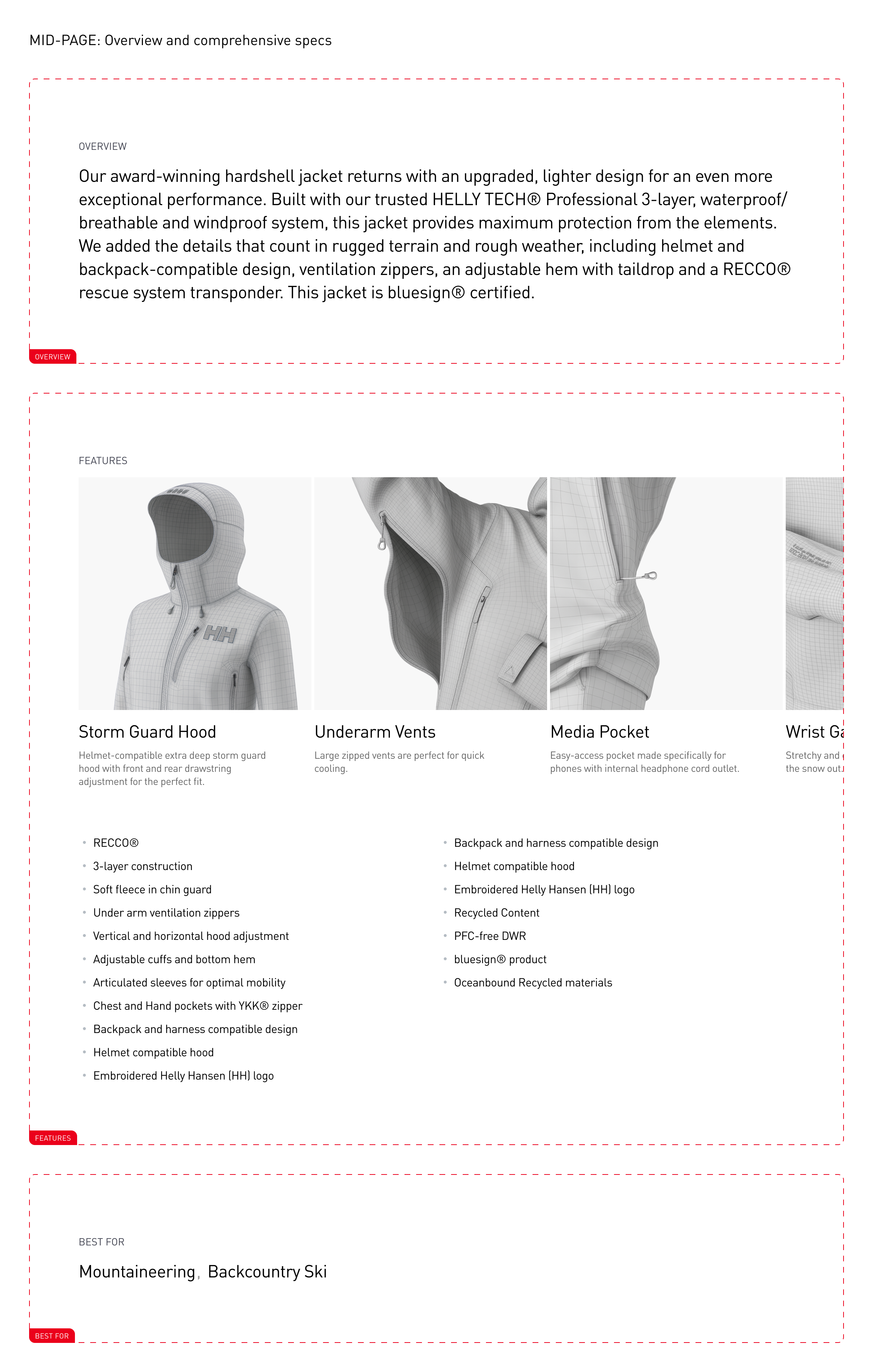
Mid page
Result: removed double column vertical scroll, established clear page structure focused on conversion while maintaining complete information access.

Desktop after
Mobile-first without desktop compromise
67% of Helly Hansen traffic comes from mobile, but desktop drives higher AOV. The design couldn't sacrifice either experience.
Solution: Truly responsive, not just scaled
- Mobile: vertical performance stack, horizontal color scroll, unified sticky ATC
- Desktop: horizontal performance comparison, expanded gallery, persistent buy block
- Both: 44×44px minimum tap targets, WCAG AA compliance, identical feature parity
Result: eliminated mobile-specific friction while enhancing desktop spatial efficiency.

Mobile before

Mobile after
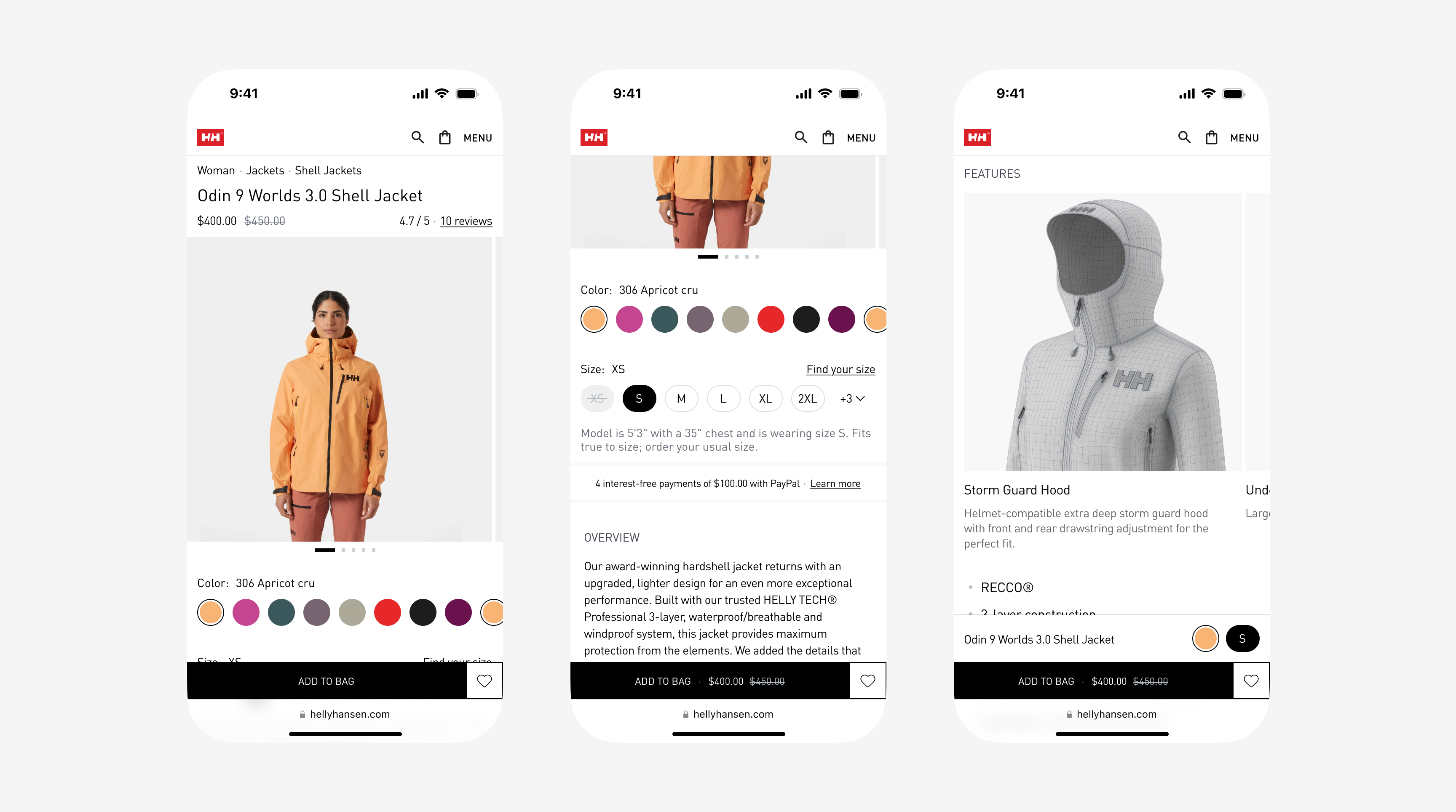
Mobile after
Brand elevation vs. conversion optimization
Helly Hansen's clear design couldn't be compromised by aggressive sales tactics, yet conversion needed dramatic improvement.
Solution: Confident restraint
- Moved away from star ratings (visual noise) → kept uncluttered numeric "4.7/5”
- Single-row color swatches with contextual badges → no three-tier clutter (for core, limited time, and items on sale) and product images to show different colors
- Typography-led design (only using icons/visuals where it serves the purpose)
Result: Increasing purchase momentum whilst maintaining proper brand perception.
Key improvements
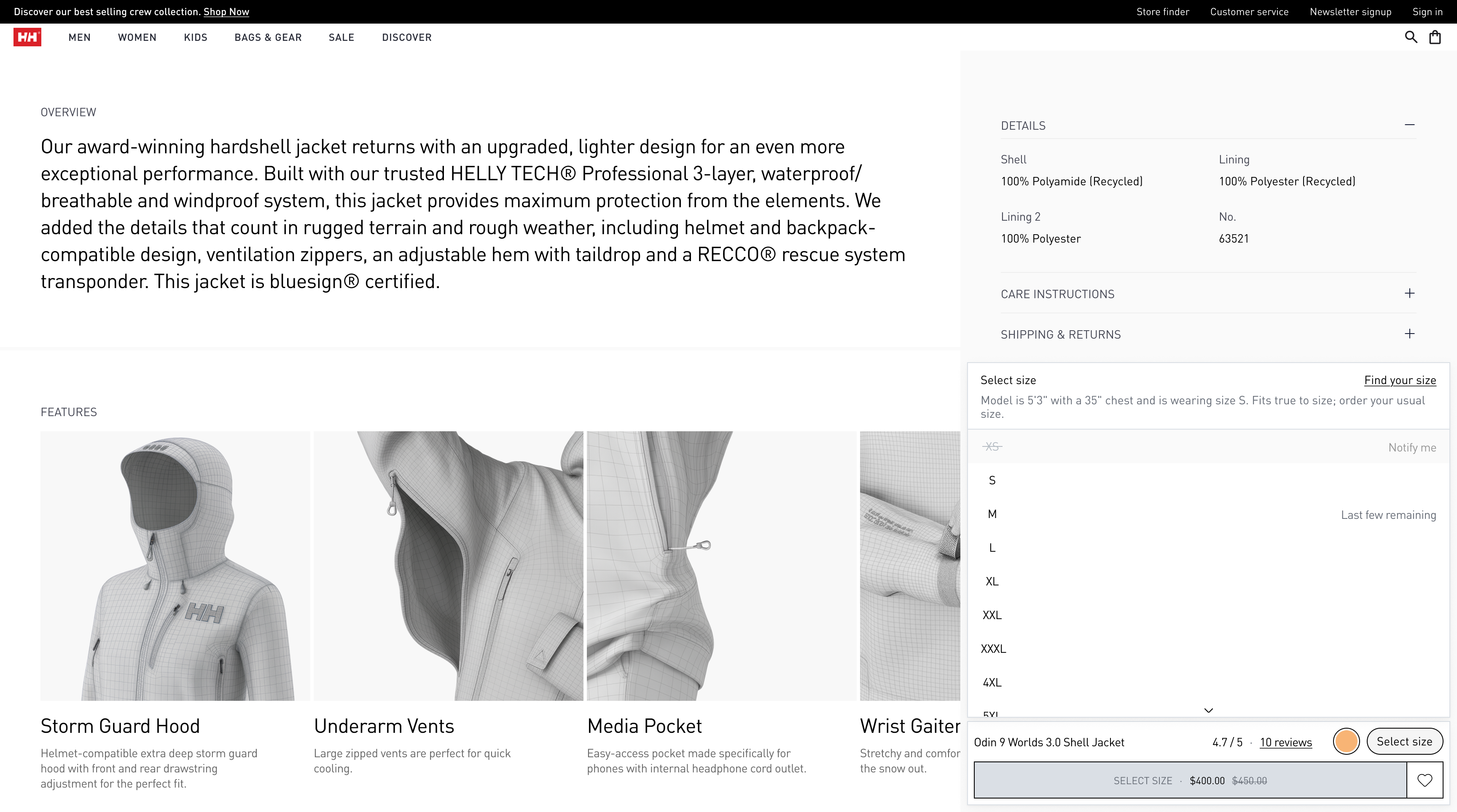
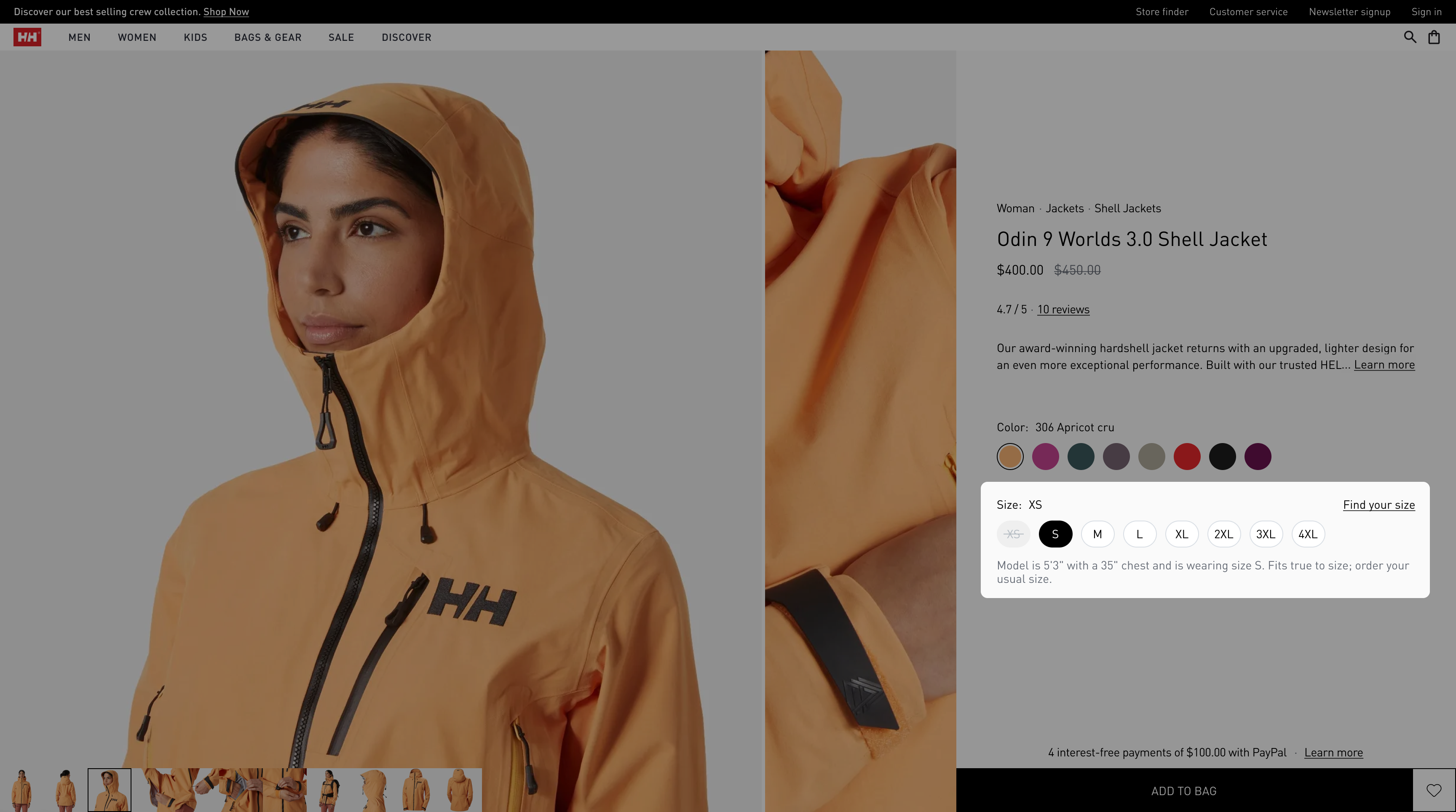
Smart color and size selectors
Before: All swatches exposed (visual chaos), unclear size availability
After:
- 8–10 most relevant colors inline with "+ X more" dropdown
- Contextual badges on swatches (only when relevant)
- Size selector shows category-appropriate range (e.g., men's footwear 39–44)
- Out-of-stock states with "Notify me" option
Impact: Reduced decision paralysis, maintained complete choice access without overwhelming interface.

Desktop size selection

Mobile size selection
Performance storytelling
Before: Generic product descriptions, buried technical specs.
After:
- Visual performance ratings (Waterproof, Breathable, Insulated) with icon + bar
- Short inline explanations
- Desktop: horizontal comparison layout
- Mobile: vertical stack to save space
Impact: Technical confidence building without requiring users to hunt for specs.

Performance before

Performance mobile before

Performance after

Performance mobile after
Unified sticky CTA
Before: Sticky button at the top of the screen (only on mobile)
After:
- Unified container housing USPs + primary CTA
- Strategic visual rhythm connecting trust signals to action
Sticky menu mobile, before
Sticky menu mobile, after
Sticky menu, after
Design principles applied
Momentum over steps
Every interaction moves toward purchase. Removed all dead-end paths and circular navigation loops.
Sticky menu size selection, after
Trust over persuasion
Social proof and guarantees integrated naturally — no aggressive sales tactics.
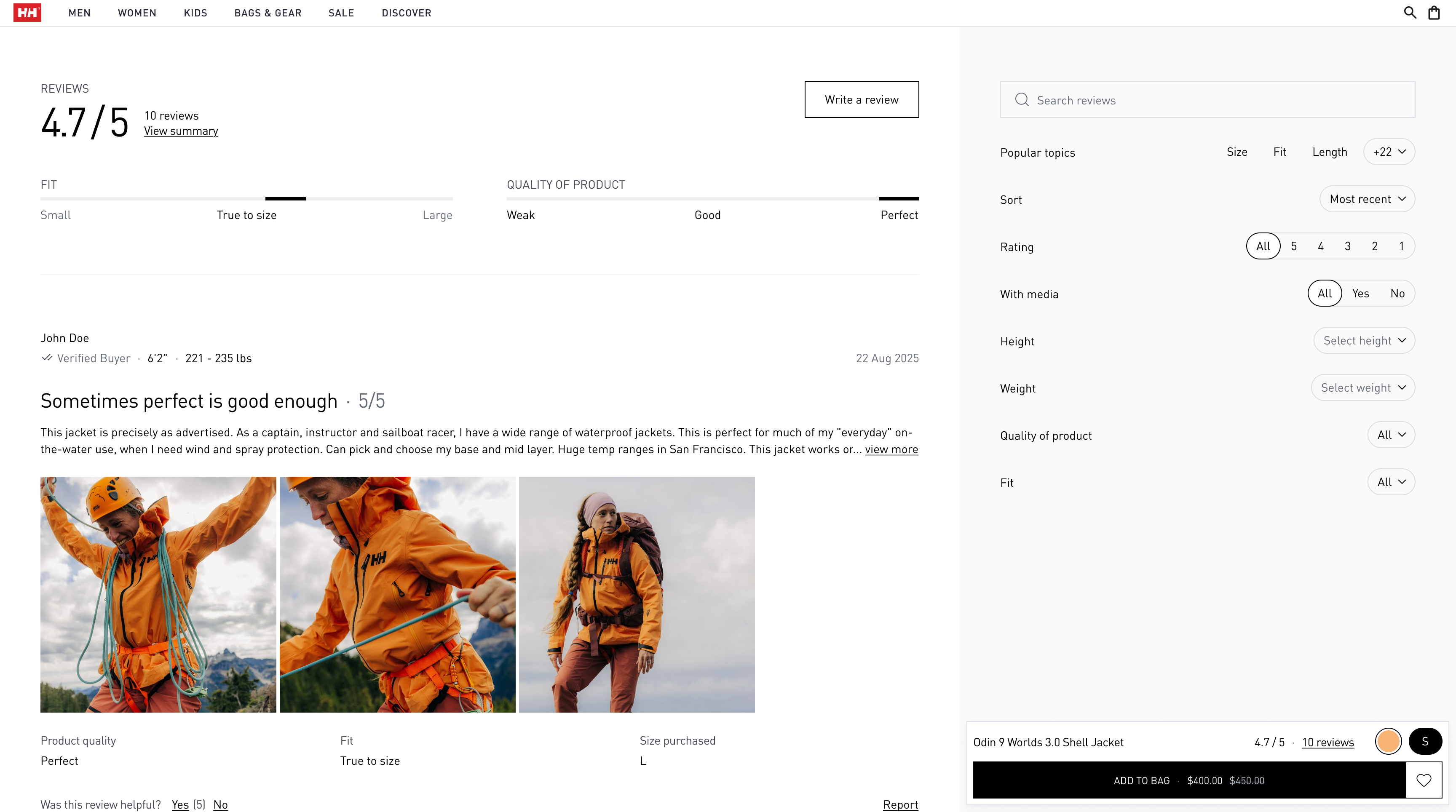
Reviews section
Clarity over cleverness
"Fits true to size — order your usual size" beats "True fit." Direct language, zero ambiguity.
Desktop model info
Flexibility for scale
Flexible layouts that adapt automatically to products with 4–20 images, with/without tech videos, sale/non-sale states.

Hero options

Content options
Closing thoughts
Beyond conversion — what actually shipped
Performance gains
- 40% reduction in above-the-fold content density without sacrificing information completeness
- Zero layout shift — no content jumping during load, critical for mobile trust
Scalability delivered
- Single design system serving 100+ SKUs across three product categories (apparel, footwear, accessories)
- Component library with reusable patterns, reducing future design time by ~60%
- Translation-ready copy structure tested across English and German

Translation-ready copy
The hidden lesson
E-commerce design isn't about making things beautiful — it's about making decisions effortless. Every pixel, every word, every interaction exists to answer one question: "Should I buy this?" Not "Look how premium we are" or "Check out this cool micro-interaction" or "Here's every possible piece of information you might want" — just "Here's exactly what you need to feel confident clicking 'Add to cart' — no more, no less."