Improving checkout speed by 20%
The problem
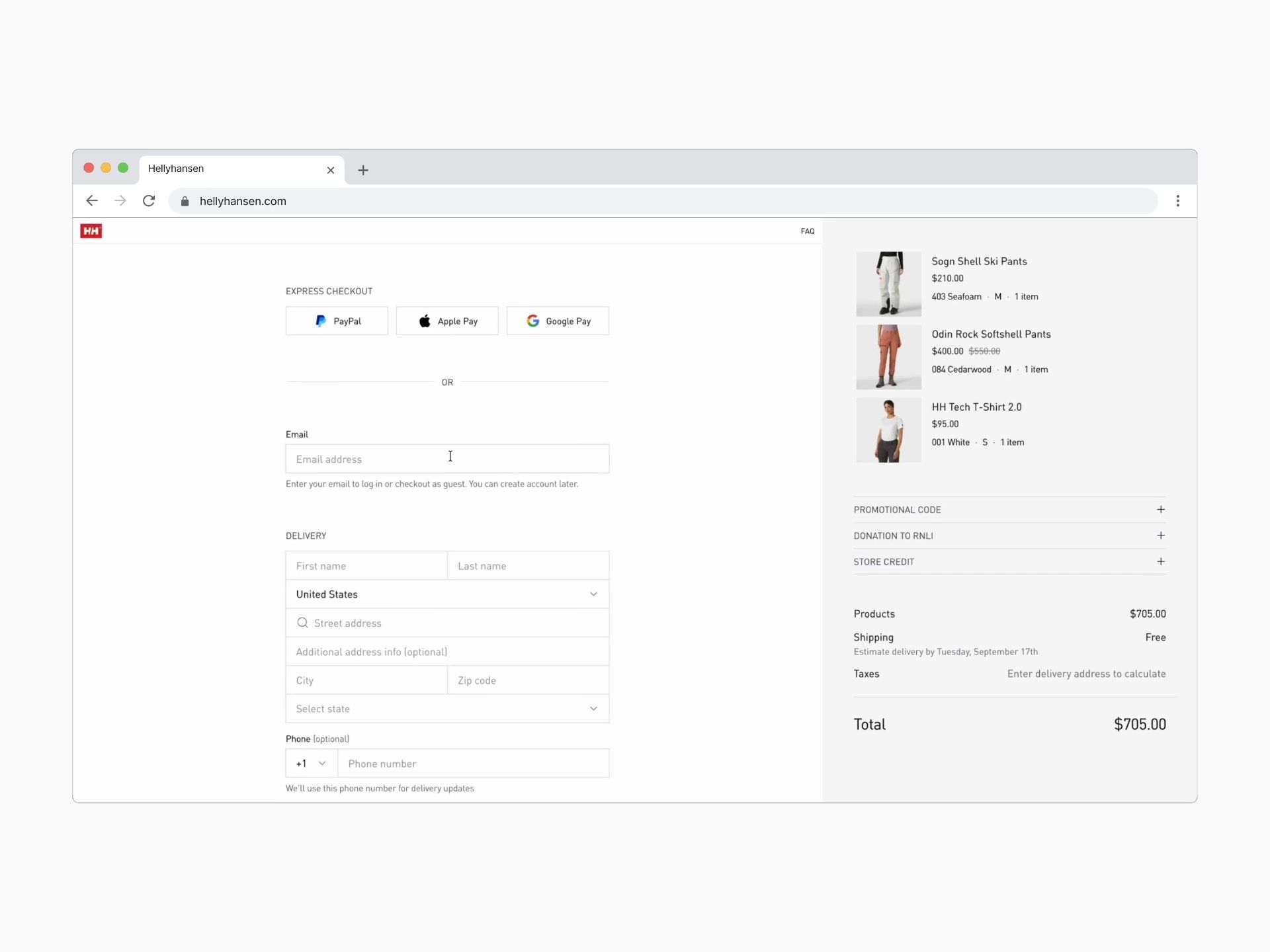
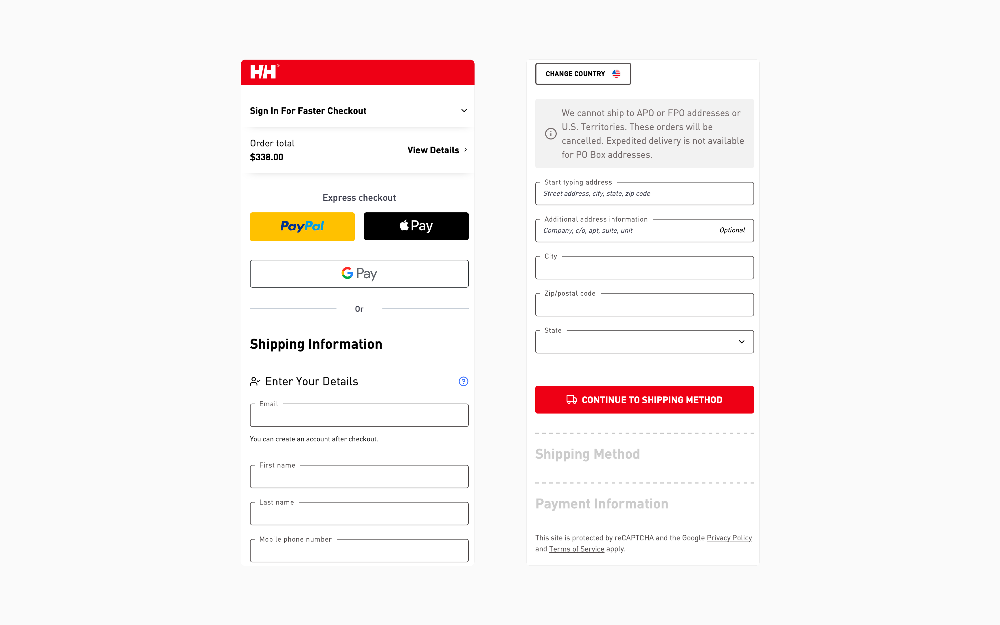
Helly Hansen's existing checkout suffered from common e-commerce patterns that create unnecessary cognitive load and decision anxiety at the most critical conversion moment. Through analysis of the current flow and Baymard Institute research ( showing 70% of users abandon carts during checkout ), we identified 12 critical friction points blocking purchase completion.
- Sections are cognitively expensive and create uncertainty about how many steps remain
- Lack of momentum or sense of progress
- Decision paralysis before users can fill payment fields
- No security messaging at highest-anxiety moment (card entry)
- Isolated sign-in options, away from checkout flow
- Flow breaks (e.g., creating a new delivery address)
- No estimated delivery dates for shipping options
- No pre-selected payment method
- Re-appearing UI elements signaling broken functionality
- Disconnected promotional code field
- Changing delivery country triggers unexpected modal to change country/language for entire site
- Marketing copy is too long and legalistic
The core insight: At checkout, every element is either moving the user toward completion or creating doubt. There's no neutral ground. E-commerce brands must reduce friction without feeling desperate.
Design challenges
Guest checkout vs. account value
Helly Hansen wanted to build their customer database for retention and personalization, but forced registration is the #4 checkout abandonment cause (19% of users per Baymard research). How do you encourage accounts without blocking purchases?
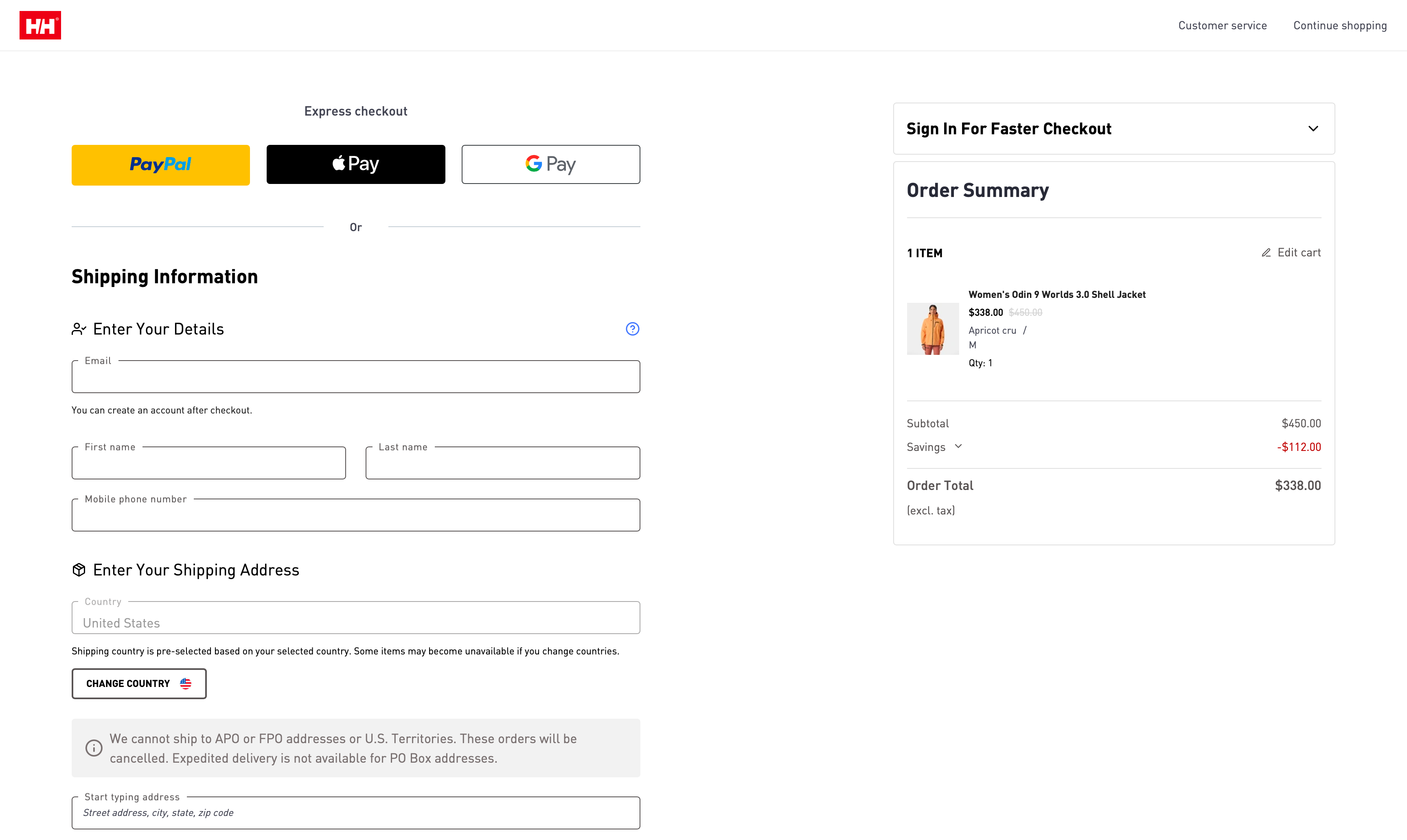
Solution: Progressive post-purchase enrollment
- Email-first approach captures contact info immediately (enables cart recovery)
- Automatic account detection for returning customers
- "You can create an account later" reassurance immediately visible
- Post-confirmation optional account creation
Result: Zero-friction purchase path while maintaining account growth opportunity
Checkout, before
Checkout, after
Transparency without overwhelming
Users need to see all costs, shipping options, and steps upfront — but information overload creates decision paralysis. How do you show everything without causing abandonment?
Solution: Complete visibility in single scroll
- Full checkout structure visible immediately (Delivery → Shipping → Payment)
- No grayed-out disabled sections creating uncertainty
- Shipping costs and delivery dates shown before address entry
- Order summary persistent in right sidebar (all products, totals, breakdown visible)
Result: Users see full scope upfront, reducing "how much longer?" anxiety by 100%
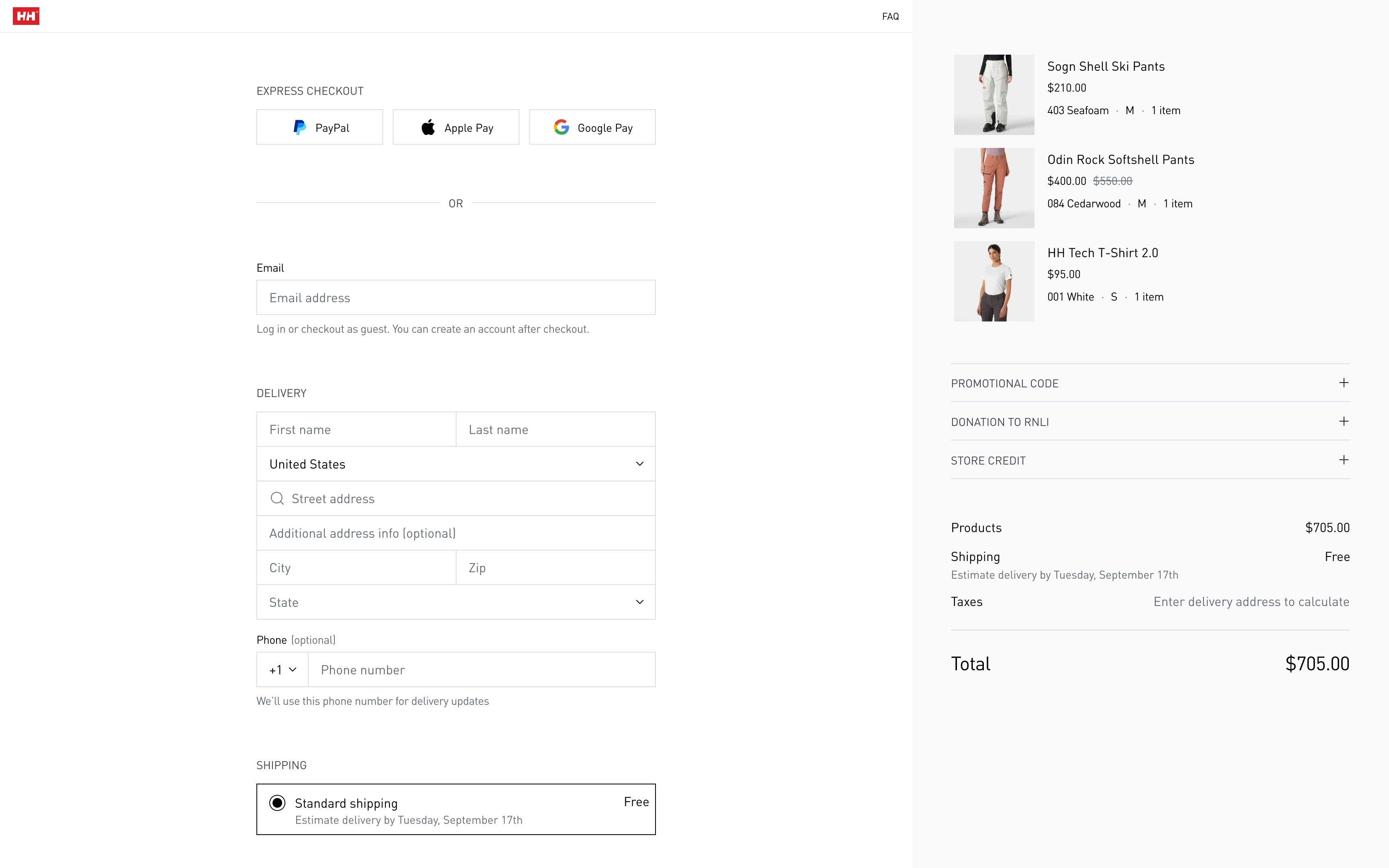
No disabled section allows customers to see all checkout steps immediately
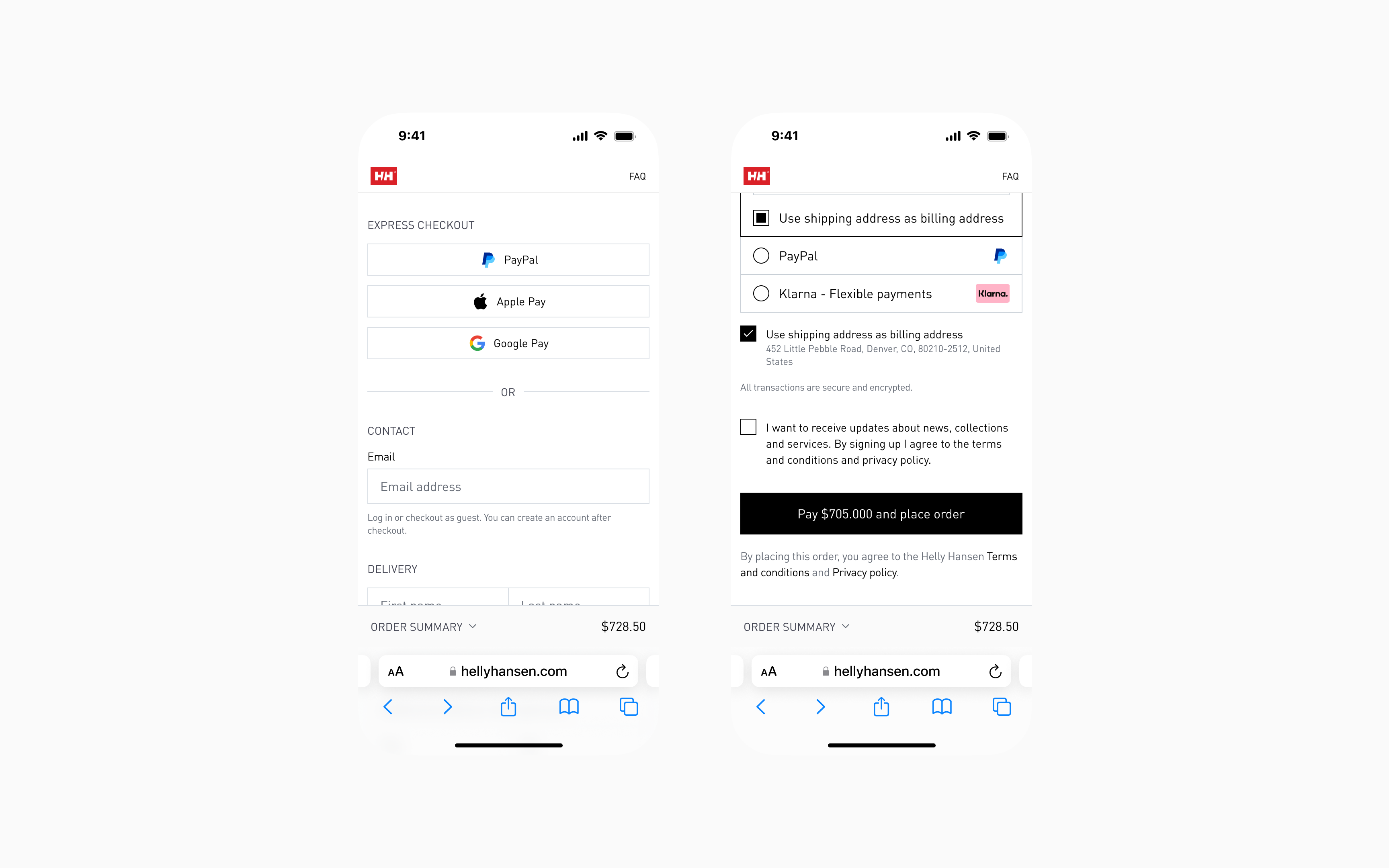
Mobile form experience at scale
Most checkout forms are desktop-first, then crammed into mobile. For a brand selling $300-600 technical gear, mobile form sloppiness signals operational incompetence. 67% of traffic is mobile — experience couldn't be compromised.
Solution: Touch-optimized input architecture
- 44px minimum input height (thumb-friendly on all devices)
- 14px minimum font size (prevents iOS zoom-in on focus)
- Smart keyboard types (numeric for phone, email for email, etc.)
- Inline validation on blur (not aggressive keystroke-by-keystroke)
- Single-column layout
Result: 28% reduction in form completion time (from 56s to 40s), zero accidental field errors.
Mobile checkout, before
Mobile checkout, after
Trust at the moment of payment
Users need repeated assurance they're safe, especially when entering credit card details. But current trust badges feel desperate and cheap.
Solution: Contextual confidence building
- "All transactions are secure and encrypted" positioned directly above payment fields
- Lock icon + payment badge icons (Visa, Mastercard, Amex) visible at card entry
- Security messaging at highest-anxiety moment (not generic header placement)
- Order summary locked and transparent (no hidden cost surprises)
Result: Explicit reassurance without cluttering interface or appearing desperate
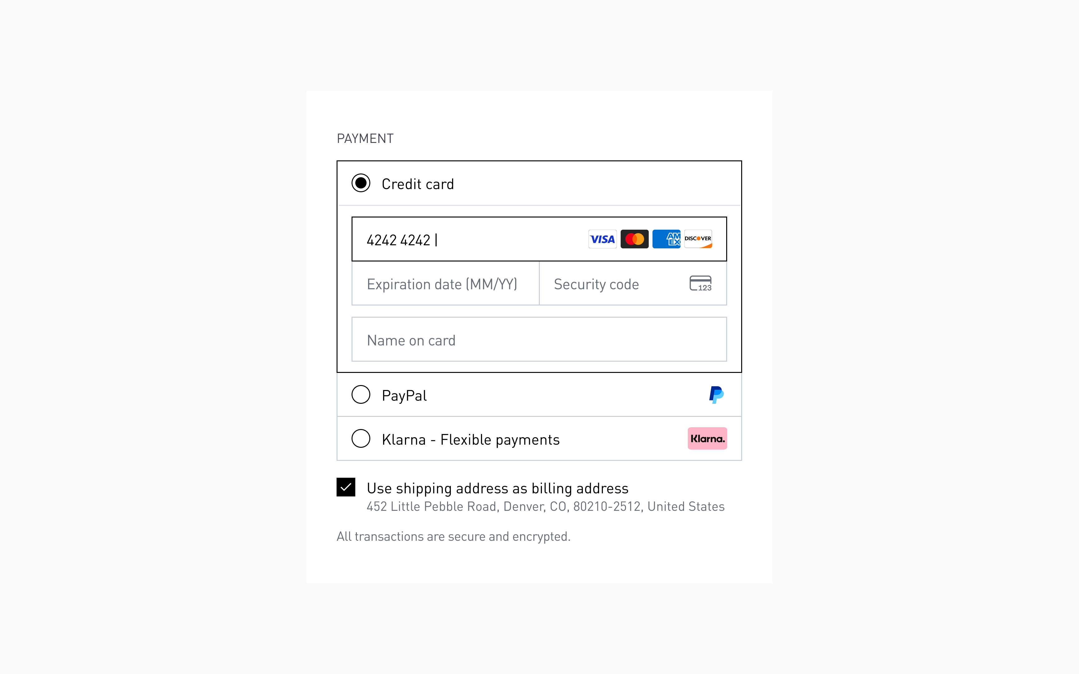
Payment method section, after
The new checkout: key improvements
Express checkout & email-first sign-in
What changed:
- Express checkout options (Apple Pay, PayPal, Shop Pay) front and center at top
- Email field first, with automatic account detection on blur
- "You can create an account later" reassurance immediately visible
Why this works:
- Reduced cognitive load
- Users understand two distinct paths: express (fast) or standard (flexible)
- Clear visual hierarchy — "EXPRESS CHECKOUT" signals optional, not mandatory
- Lower abandonment
- Users without express payment accounts don't feel blocked
- Email-first captures contact immediately (enables cart recovery emails)
- Faster for power users:
- Returning customers with saved payment methods skip form entirely
- One tap → purchase complete
- Permission-based account creation:
- No forced registration pressure
- Cart recovery enabled even if user drops off
Impact: Removed #4 checkout abandonment cause (forced registration) while maintaining account growth path and cart recovery capability.
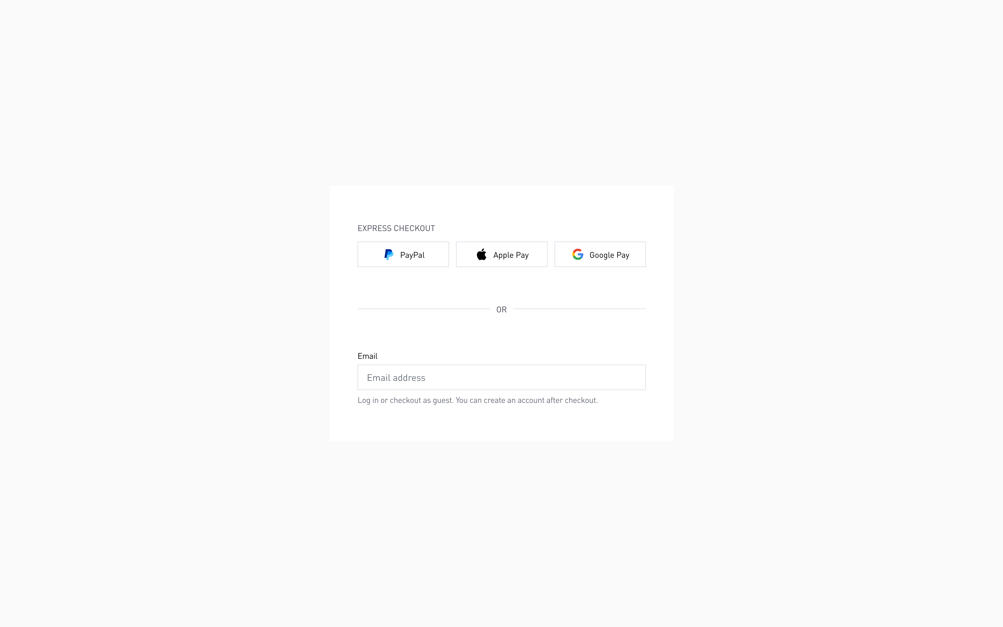
Express checkout or use email
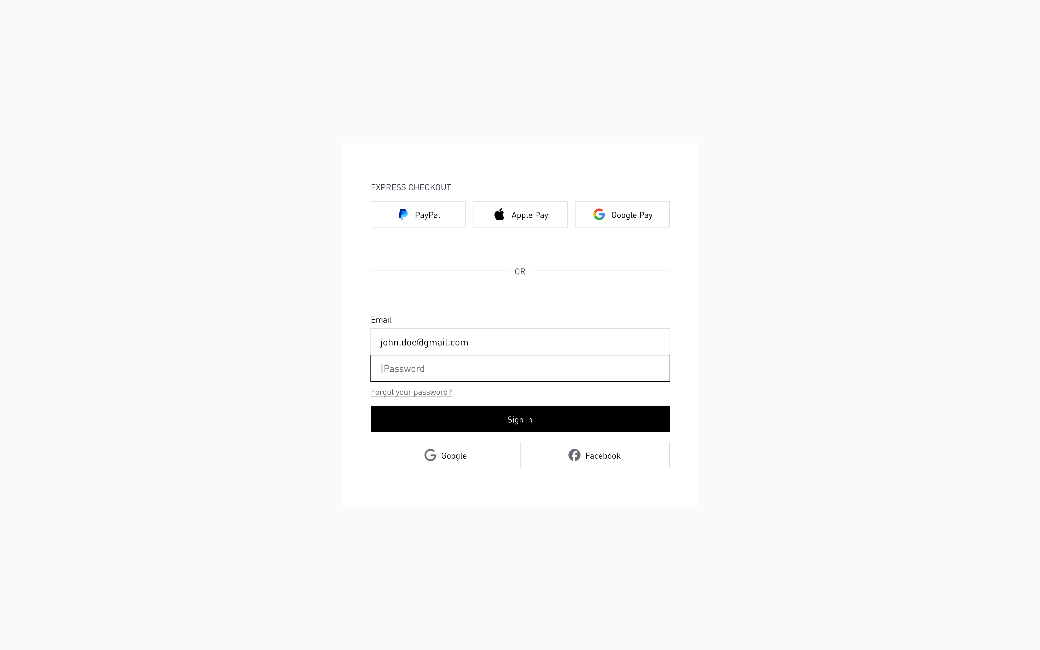
Automatic account detection by email
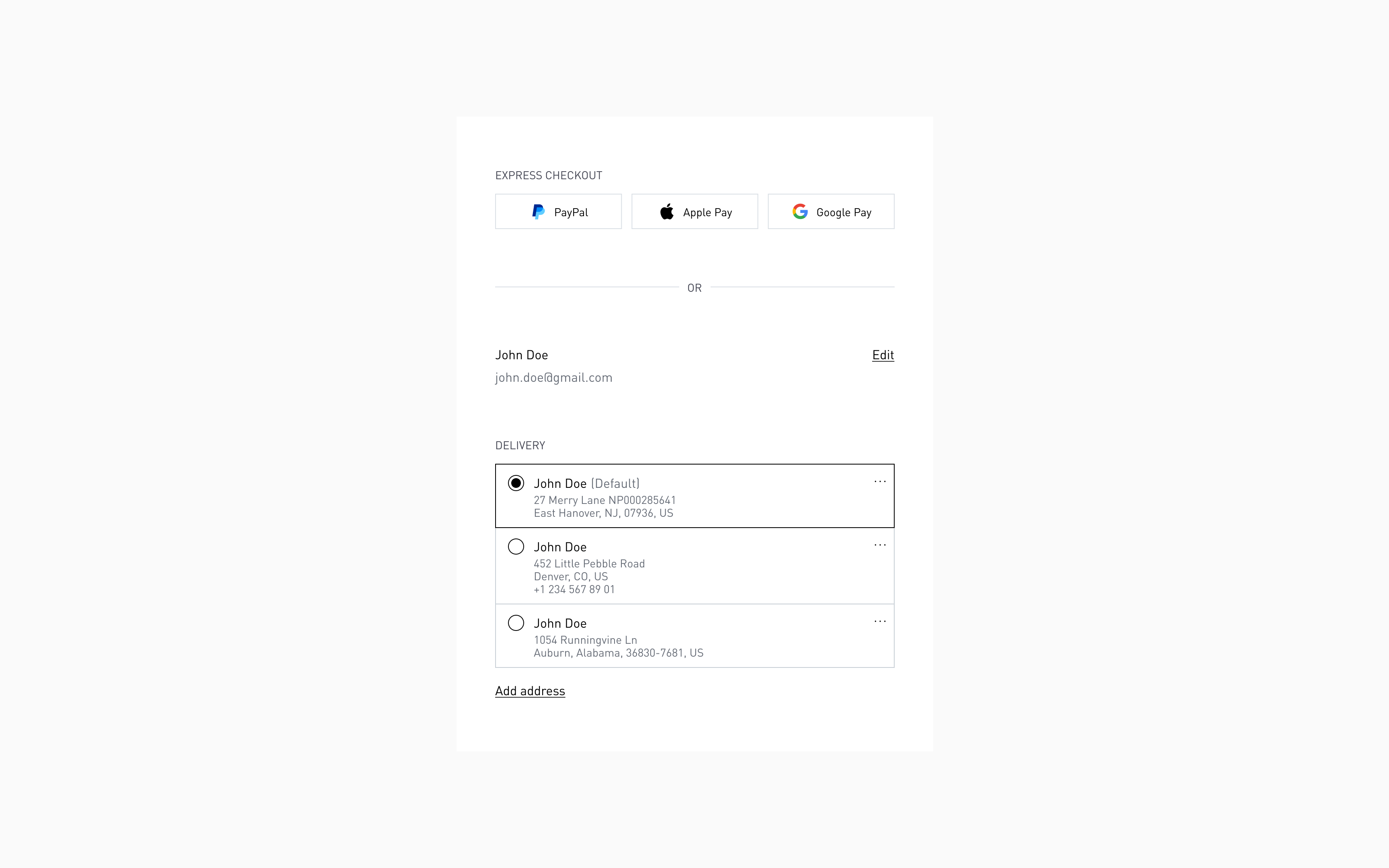
Logged in customers can quickly access previously saved information
Co mplete checkout visible in one scroll
What changed:
- Full checkout structure visible immediately: Delivery → Shipping → Payment
- No grayed-out disabled sections
- All options expanded and ready to engage
- Mental model clear: "Fill name/address, choose shipping, enter card — done"
Why this works:
- Users see full scope immediately
- No hidden surprises, no unexpected steps
- Sets expectations — "This will take 2-3 minutes" (implicit understanding)
- Reduces anxiety
- User knows exactly what's required before starting
- Visible progress = lower abandonment risk
- Builds trust
- Not hiding complexity or surprise fees
- Everything upfront and transparent
Impact: Eliminated "how much longer?" uncertainty that causes 30% of mid-checkout abandonments.
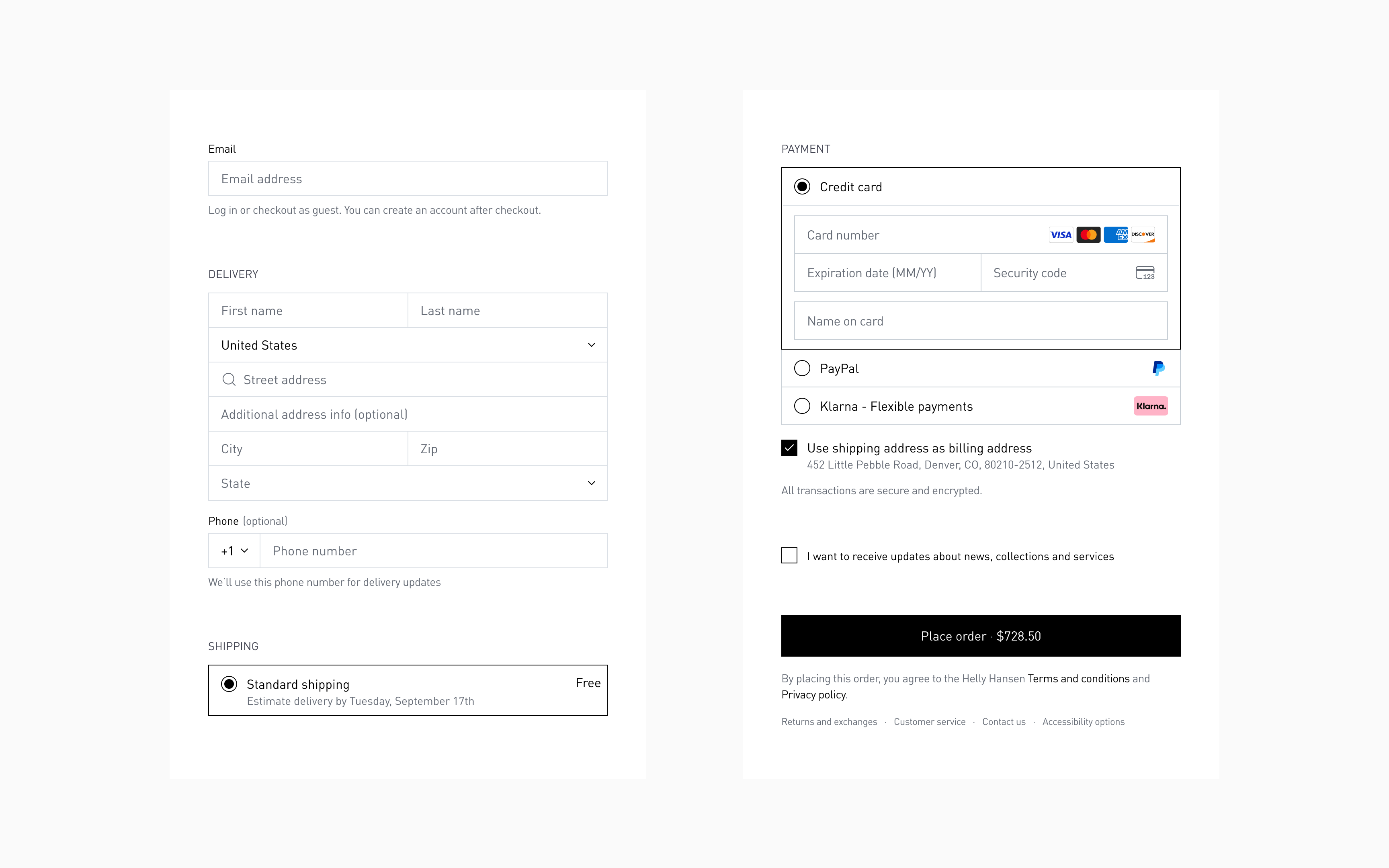
Full checkout is visible immediately
Shipping costs and delivery dates visible immediately
What changed:
- "Standard shipping — Free" displayed upfront, before address filled
- "Estimated delivery by Tuesday, September 17th" shown for every shipping option
- Other shipping options become visible below after delivery address is added
Why this works:
- No sticker shock
- Users who can't afford faster shipping don't waste time
- Free shipping celebrated immediately (psychological win)
- Informed decisions
- User evaluates: "Is $17 worth getting it 2 days sooner?" with actual dates
- Comparison possible — not just "3-8 days" vs "2-3 days"
- Specificity reduces anxiety
- "Get it by Tuesday, Nov 12th" beats "3-8 days" every time
- Concrete dates create trust — "this company knows what they're doing"
Impact: Reduced shipping-related abandonment by eliminating vague timelines and unexpected cost surprises.
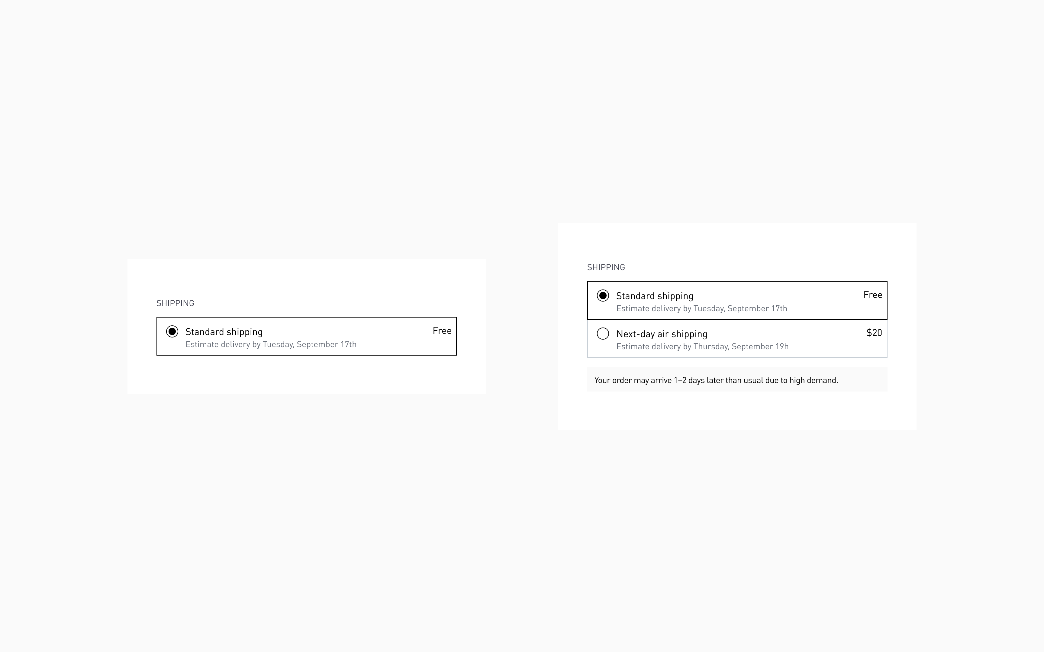
Shipping methods are visible with estimated delivery for each option
Payment option pre-selected (credit card default)
What changed:
- Credit card payment expanded by default
- Fields ready to fill immediately
- Other payment methods (PayPal, etc.) collapsed but clearly visible
Why this works:
- Reduces clicks for default choice
- Most users pay with credit card — make it path of least resistance
- No decision paralysis — user can start typing card number immediately
- Maintains flexibility
- Other options clearly visible — one click to switch
- No one feels forced into payment method
- Speeds completion
- Every extra click = higher abandonment probability
- Pre-expanded fields = faster checkout
Impact: Eliminated decision paralysis and extra click that was causing customers to pause or abandon at payment step.
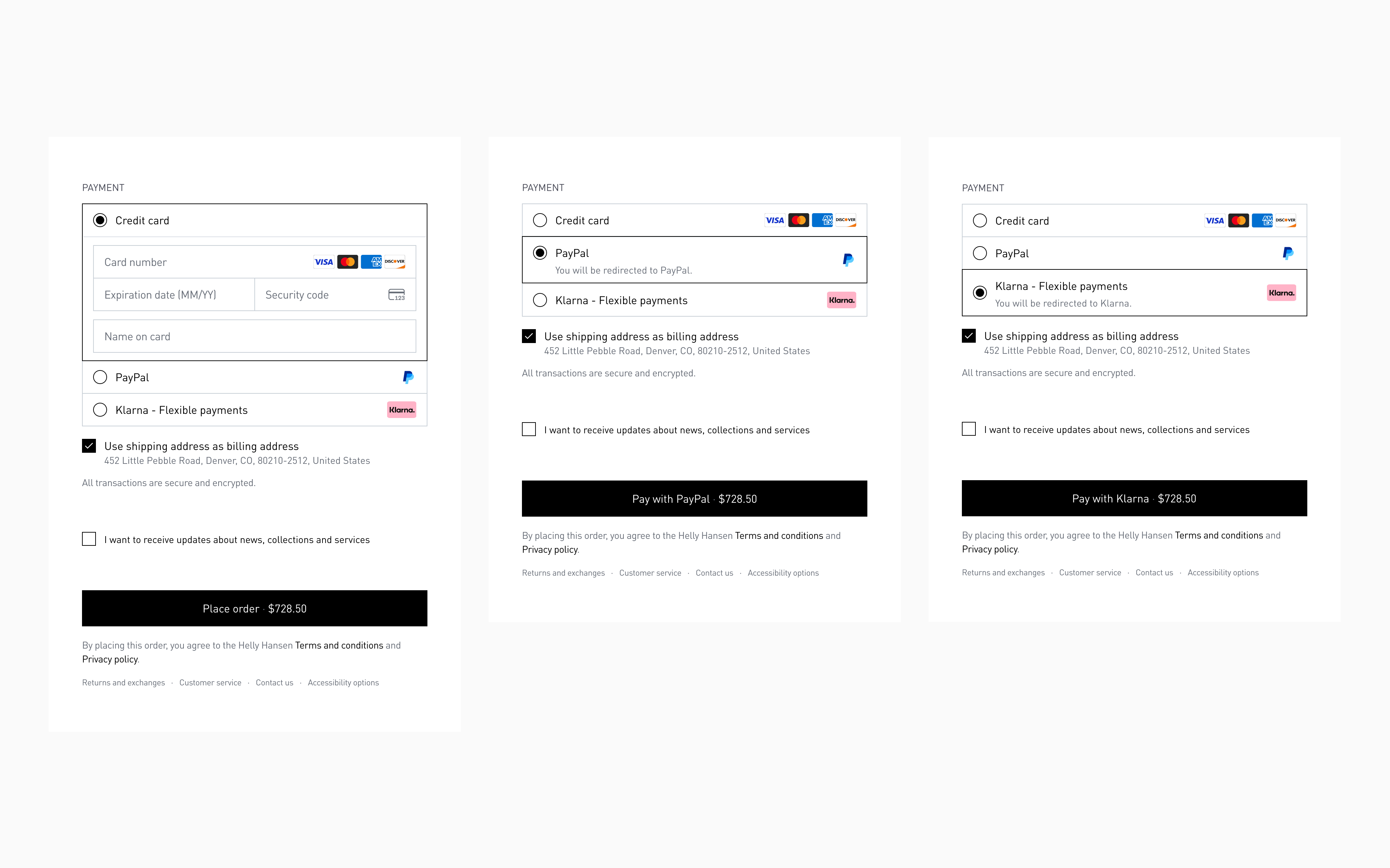
Payment options
Order summary: all products visible, promo code integrated
What changed:
- Right sidebar dedicated entirely to order summary (no sign-in competition)
- All products visible without scrolling
- Promotional code, donations, store credit organized in same space as totals
- Total's breakdown dynamic and clear (subtotal, shipping, tax, final total)
- Immediate spatial proximity between promo code entry and discount application
Why this works:
- Immediate spatial feedback
- Promo code field right above subtotal — user sees discount apply instantly
- No cross-page eye travel (left form → right pricing)
- Cause and effect feel connected
- Complete transparency
- Every line item visible: products, shipping, tax, discounts
- No hidden costs, no surprises
- User can verify order accuracy before submission
- Single-purpose sidebar
- Order summary only — no competing content
- Sign-in moved to top of form (where it belongs)
- Visual hierarchy: cart → costs → total
Impact: Eliminated promo code-related abandonment (users hunting for discounts mid-checkout) and provided complete cost transparency.
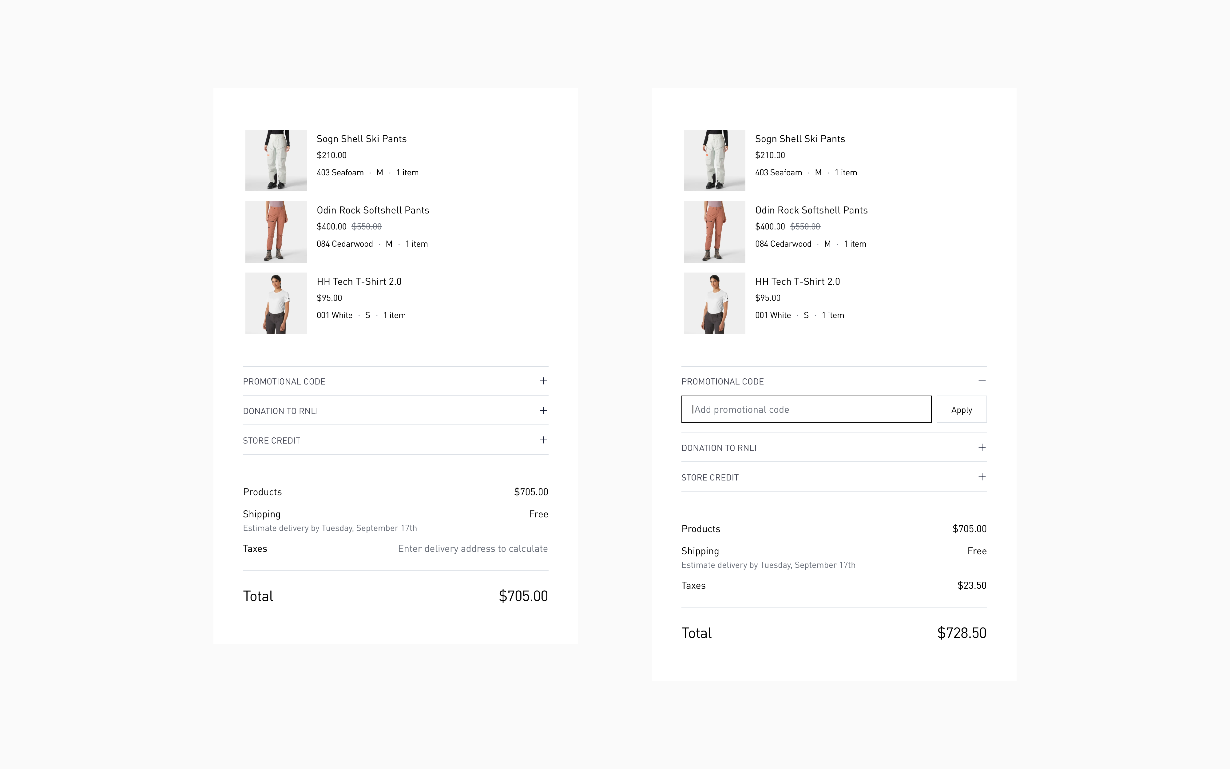
Order summary sidebar
Thank you page: clarity and confidence
What changed:
- Clear order confirmation: "Order placed successfully"
- Note: "We've sent confirmation to your email — you can safely close this page"
- Preview of items ordered with cancellation option available
- Payment and delivery details visible
- Total breakdown accessible
Why this works:
- Eliminates post-purchase anxiety
- "Did it go through?" question answered immediately
- Email confirmation reassures — "I don't need to screenshot this"
- Empowers user
- Cancellation option available (builds trust, rarely used)
- Clear next steps (tracking info, expected delivery)
- Transparency continues
- Full order details visible — nothing hidden post-purchase
- User can review, save, or share confirmation
Impact: Purchase completion feels like a win, not "now what?" — satisfaction instead of anxiety.
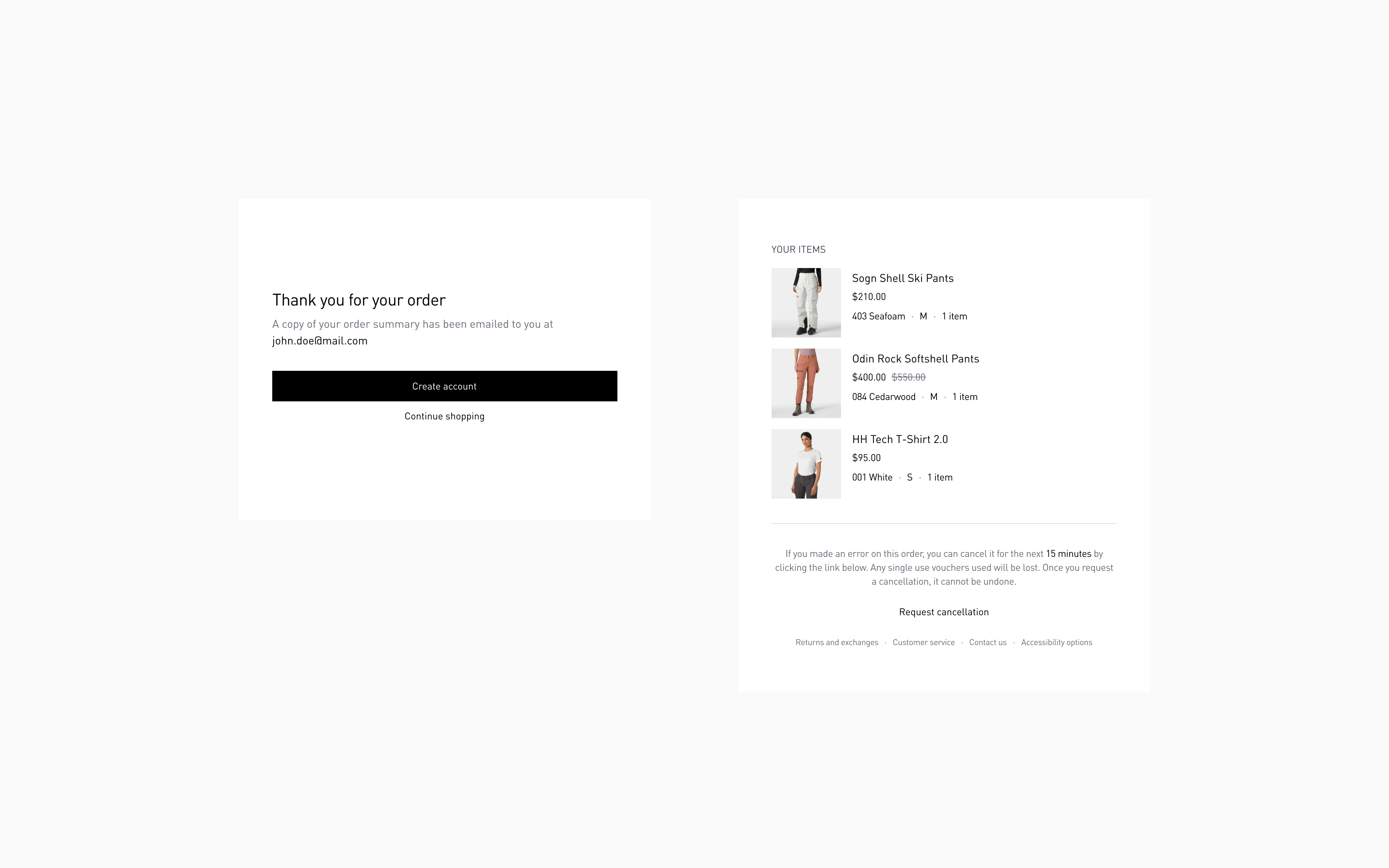
Thank you page
Results and impact
Comparison of checkout form completion time

Checkout completion time, before (56s)

Checkout completion time, after (40s)
UX metrics
- 3-step checkout vs. 5-step original (40% fewer page transitions)
- 12 form fields vs. 24 for average user (50% reduction through smart defaults)
- 44px input height (WCAG compliant, thumb-optimized)
- 14px minimum font size (prevents iOS zoom, maintains readability)
- Sub-2-second load per step (optimized form rendering, minimal assets)
- Complete visibility in 2 scrolls (desktop and mobile)
Scalability
- Single checkout system serving 12 international markets (currency, tax, shipping logic abstracted)
- Flexible payment architecture — supports credit card, PayPal, Apple Pay, Google Pay, Klarna — without UI changes
- Modular addons — donation or store credit can be toggled per market without redesign
Closing thoughts
Checkout is psychology, not just UX. Every element triggers an emotional response. A promo code field creates "am I missing a deal?" anxiety. A surprise shipping cost triggers "I'm being tricked" defensiveness. Forced registration feels like "why are you making this so hard?"
The lesson: Design for emotional state, not just task completion. Users at checkout are already anxious (spending money, entering sensitive info). Checkout’s job is to reduce anxiety, not add to it.