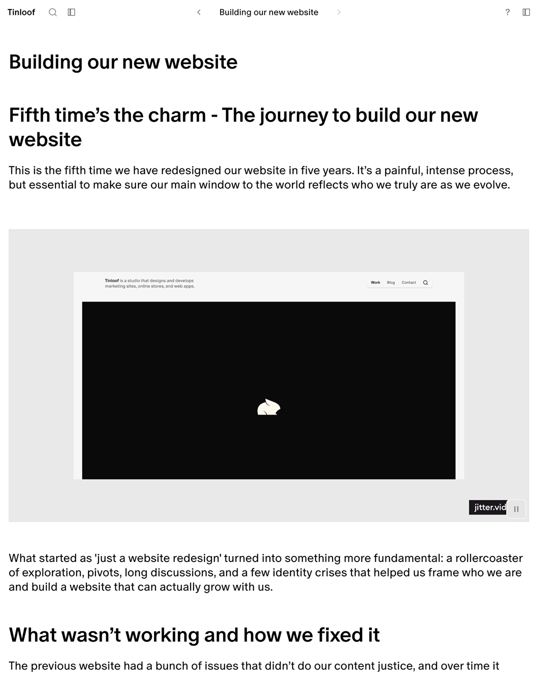
Fifth time’s the charm - The journey to build our new website
This is the fifth time we have redesigned our website in five years. It’s a painful, intense process, but essential to make sure our main window to the world reflects who we truly are as we evolve.
What started as 'just a website redesign' turned into something more fundamental: a rollercoaster of exploration, pivots, long discussions, and a few identity crises that helped us frame who we are and build a website that can actually grow with us.
What wasn’t working and how we fixed it
The previous website had a bunch of issues that didn’t do our content justice, and over time it started to become way too hard to scale as our needs evolved.
Therefore, we began listing the problems and tried to solve each one.
Poor navigation
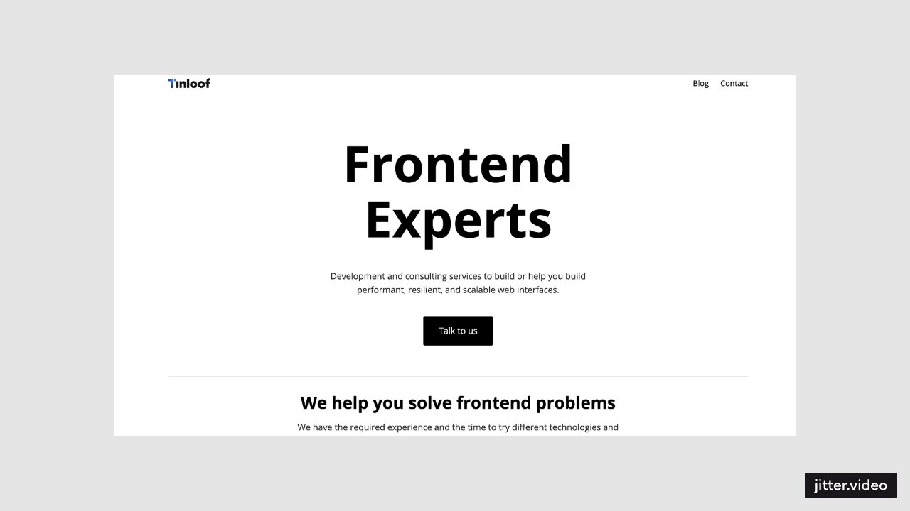
One of the core problems was navigation. Content felt disconnected, and navigating it was like being in a maze: there was no straightforward way to discover our work except by jumping from one recommended case study to the next or going back home each time. It was almost impossible to understand where to find what.
To fix this, we built a flexible, persistent app-like shell that makes navigation a breeze. It's a UI pattern that works well for complex products like Notion, Linear, and Slack, and it was the perfect fit for us too. Now you can navigate between case studies with a nice sense of continuity and always have a high-level overview of all content at all times.
On top of that, the shell is designed to be adaptive, so it morphs and displays different relevant content depending on where you are on the website. Think of it as a highly ergonomic map that makes it impossible to get lost.
Lack of content flexibility
We knew we wanted to add new types of content to the website. Our previous format was rigid and too visually oriented, huge images and little to no text.
It was poorly suited for providing details about the work done, especially for engineering pieces.
For this reason, we opted for something more flexible: a modular system.
Any content piece (case studies, engineering write-ups, behind the scenes, blog articles, etc.) shares a set of 'building blocks' and can now be fully visual, text-driven, or anywhere in between.
We essentially removed any preconception about what a specific content type should look like. Our biases were just getting in the way. In our new system, each individual content piece takes the form that delivers more naturally and effectively.
This decision allowed us to be a bit more ambitious with blocks, and we ended up introducing new ones like diagrams, which turned out to be super useful for visualizing and explaining concepts across various topics, from engineering to branding architecture.
No clarity on who we are, what we do, and our clientele
Previously, our identity was fuzzy. We had just a generic description and a couple of sentences about what we do. We did this on purpose to focus on the work, but it ended up being too dry. In practice, we were vague; great work and great clients got buried, and the context about what was done in each case study was essentially nonexistent.
We decided to maintain our 'simple and concise' style, as it reflects our vibe, but we added a lot of additional information that we felt was missing.
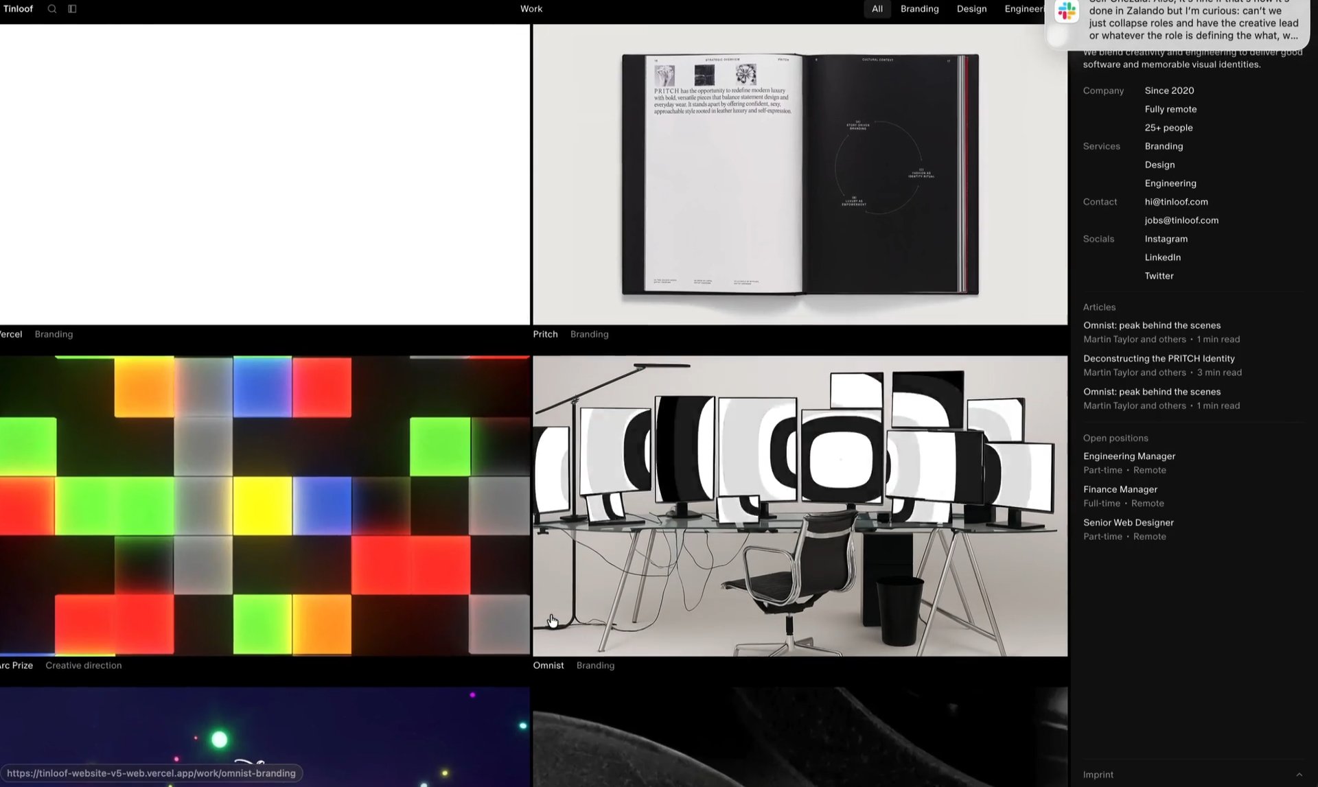
Our weapon of choice to enhance our pages, while keeping the main content area clean, is a dynamic right sidebar designed to display different information based on the current page.
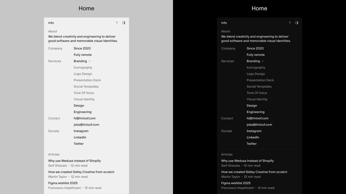
On the homepage, you can now immediately see:
- Who we are and how we work
- Our team size
- A detailed list of our services
- Multiple ways to contact us
- Our socials
At the same time, within each case study, we provide all the necessary context, including:
- Detailed description of the project
- Year
- Scope
- Credits
- External links
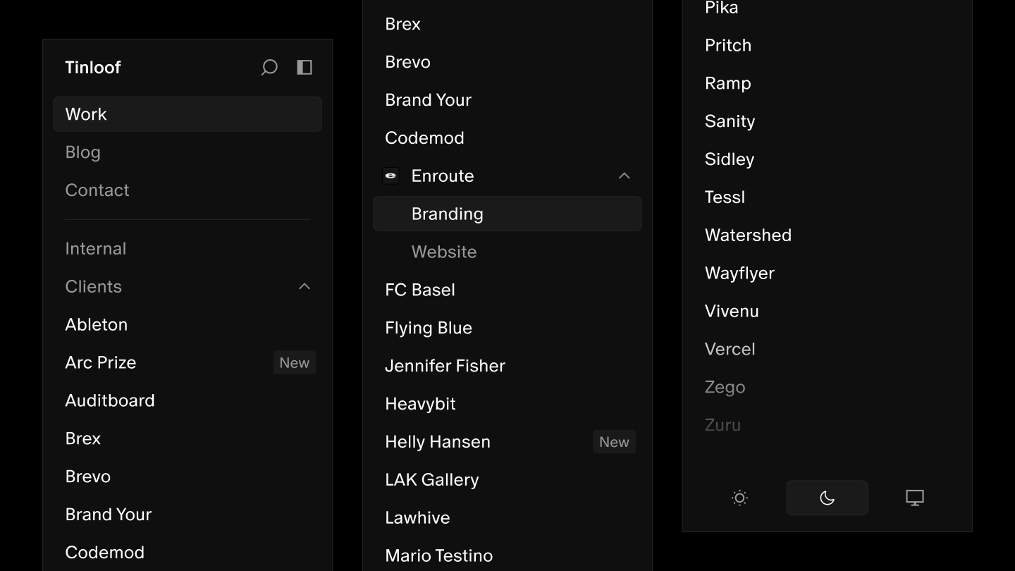
Finally, to improve visibility into our clientele, the left sidebar contains an alphabetical list of all our clients. It serves as both the cockpit for navigation (each client name is essentially a folder containing all the case studies for work we did for them) and a compact way to display who we've worked with, right above the fold.
Lack of personality
While minimalism and purity are principles we identify with a lot, the previous design felt a bit too bland, lacking any hint that felt unmistakably ours. As the project started, we knew right away that one of the biggest challenges would be finding our ‘quirk’ while keeping it nice and clean.
The solution came through subtleties and the overall feel of the UX, in the micro-animations, in speed and snappiness beyond just the global, static look. We aimed for something that feels familiar at first sight, yet fresh and personal through details crafted with purpose.
Sharp vs. rounded corners
Corner radius sounds trivial until you realize it affects everything. Fully rounded feels friendly, familiar, product-like but also safe, almost generic. Fully sharp feels editorial, design-forward but loses some of that approachable softness.
We ran in circles for weeks before settling on a rule: surfaces are sharp, interactive elements are rounded.
Sidebars, dialogs, containers get sharp edges. Buttons, inputs, toggles get rounded.
It creates a nice visual balance: the architecture is crisp, but the things you interact with have a tiny touch of soft warmth.
It feels 'product-pop' with some edginess.
<<detail images of the corners>>
Flat vs. dimensional
Flat design is clean and ages well. But too flat can feel generic. We wanted to express a subtle sense depth.
The solution was to use a flat design as the base, and add small elements that would give depth and materiality without being obvious or too noticeable:
- Very subtle borders
- Gentle fades on scrollable areas
- Soft background blur on overlaying surfaces
- Motion and transitions
<< 50/50 showing details of the design>>
Motion and performance in harmony
Another detail that really makes this site feel ours is the combination of animations and speed. Every interaction feels smooth but snappy, just enough feedback to feel alive without being distracting. Playing with transitions is always tricky; it's extremely easy to overdo it.
We really tried to strike the perfect balance between two extremes. We wanted some transitions because they simply give life to interactions and push the boundaries of what a web-app or website can feel like, but at the same time we made sure the engineering kept the overall experience fast and performant.
Animations enhance speed, not slow it down.
The way to achieve this was to be very picky about what made sense to animate and what felt redundant or unnecessary. If the UX felt ‘heavier’ after adding an animation, we simply removed it. We used animations for very intentional moments, avoiding transitions for interactions that are way too common (e.g. scroll, page navigation, etc.).
<<video with various transitions in the UI>>
Shortcuts as a first-class citizen of the UX
Something often overlooked in web design but that can greatly improve the perceived snappiness of UX is keyboard shortcuts. We defined a set of handy key bindings that, combined with speed and subtle transitions, make navigating the website really pleasant. We use them all the time and honestly think they're not only useful but also fun. Press 's', the search dialog opens, type the first few letters of what you're looking for, hit 'Enter', and fly to any spot on the site.
<< screen capture using the shortcuts >>
Internal projects
Personality is not just how you look, but also what you do. We do tons of internal and open-source projects, but they've historically been underrepresented on our previous websites.
This time, they finally have their own place in the left sidebar, with the dignity we think they deserve.
They're the perfect playground where we can experiment, have fun, get funky, or build useful things. They're a key element of who we are and our personality.
<<video sequence of our internal projects within the website>>
The process: plans made, plans broken
We started with a roadmap and lots of good intentions, and of course it didn’t last long.
The original plan was three weeks for identity work, but it quickly became clear that wasn’t nearly enough, and more importantly, that everything else was blocked until we figured it out.
We couldn’t move forward because we didn’t know what we were moving toward.
We considered (and tried) running structured workshops with predetermined steps, but it felt wrong. We already knew most of it; it just hadn’t been articulated. So we kept it loose: long conversations, 1-to-1 jams in Figma, tons of shared inspiration, references and snippets of text flying back and forth. Ideas cross-pollinating until the right ones stuck.
<<examples of workshops, conversations, etc. whatever shows the process>>
Defining our pillars
The answers we were searching for surfaced organically, and as they took shape, we took notes. When they reached a critical mass, we finally had a set of truths we could actually design against.
Work speaks louder
A key decision was to let our work shine and take center stage. The portfolio is the ‘main character’ and we fade into the background. This philosophy was already baked into our previous websites (we’ve been logo-free for over a year now), so we just doubled down.
The way we think about it is that our website is a highly interactive, highly ergonomic ‘frame’ that maximizes the quality of experience as users consume our content, which is what really matters.
Basics front and center, no gimmicks
We believe that with the right use of basic elements like typography and color, you can get a long way. That’s why we avoid overdesigning or adding elements that just feel gimmicky.
Our surfaces need to look good, professional, and to the point.
We kept color usage minimal and refined our grayscale to be visually balanced and consistent in both light and dark mode.
For typography, we did extensive stress-testing: trying different typefaces, sizes, and weights before committing to ABC Oracle.
A website that feels like a product
From the start, we knew we didn’t want this to feel like a traditional website. After exploring different directions, we realized that we wanted an experience that feels like a product: something you use rather than just browse.
In hindsight, we felt this was the right call pretty early on, but exploring alternatives first was worth it anyway. We tried things, some survived, some didn’t make it, but every dead-end brought us closer to this conclusion.
<< Looped sequence of explorations we did that didn’t make it >>
We approached the design with a product mindset: app-like architecture, intuitive navigation, keyboard shortcuts, theme switching. Familiar patterns that make users feel at home immediately, while leaving room for our personality in the details.
This approach isn’t just about how it looks and works. It also means thinking about our new website as something we’ll scale, extend, and improve over time.
A website with increasingly more features (we already have many in our backlog) that’s meant to stick around for a long time.
Content strategy and architecture
We wanted to nail our content architecture early on, making sure design was not blind to it.
<< sequence of images from the FigJam >>
We mapped out all the types of content we currently need:
- Visual case studies
- Engineering deep-dives
- Behind-the-scenes pieces
- Blog articles
- Research pieces
Both the UI and CMS needed to be flexible enough to work with every content type. Doing this mapping at the beginning of the project helped us decide to invest in the modular, block-based system.
<< maybe a screenshot or curated frame conveying the CMS setup >>
Beyond content structure, we saw this redesign as an opportunity to audit our existing content, to trim and revamp everything that didn't meet the new standards we've now set. This is a process that kept running in parallel for the whole duration of the project.
<<50-50 of 2 videos rotating amazing assets we now have in our case studies>>
What we learned
This project taught us a lot about ourselves; in many ways, it was also a process of discovery.
What tested us
The hardest part was probably managing a team where everyone cared a lot. Strong opinions, different perspectives, biases constantly pulling in different directions. Everyone wanted this to be perfect.
That friction was valuable, as it forced us to iterate relentlessly. Layer by layer, we peeled off the unnecessary, and we found our way to something everyone was happy with. It was a process that tested our mental sanity at times, but it was definitely worth it.
<<image of the madness separators>>
As much as it wasn't easy, it definitely was fun. We are all nerds at heart, and sparring over the smallest details with passion and dedication (we ended up calling our weekly chat 'The Council'), figuring things out along the way, was something that kept us all engaged and made the final result something we all came up with. There's really everyone's contribution in the final result.
<<maybe some call screenshot or chat? Maybe the one with my dog or something>>
What surprised us
When we officially kicked off the project, the website redesign had already become an internal meme. We’d talked about it for so long, delayed it so many times, that it felt almost mythical. What surprised us was how committed everyone became once we finally started.
But even more surprising was how many ideas from throughout the year (scattered references, half-formed thoughts, things mentioned in passing) eventually ended up converging in the final result.
To be honest, this delay helped a lot. A year ago, we weren't ready to confidently define who we truly are and reflect that in a new website. The experience we gained on other projects, the way we grew as a team, it all made the final result better than it would've been if we'd rushed it.
Looking ahead
We’ve built a platform designed to grow with us: modular, flexible, ready for whatever comes next. We’re already thinking about new content types, new features, new ways to share our work and thinking. This is a living thing, and we’ll keep adding to it, iterating on it, letting it evolve as we do.
For the first time in five years, we’re not thinking about the next redesign. We’re thinking about what we’ll build on top of this one, and I'm optimistic we'll resist the ancestral urge to redesign everything again for some time.
Related
Omnist: peak behind the scenes
Context If you want to jump straight into how we created the Omnist brand identity, skip this section - it explains the product’s landscape and what kind of solution Omnist aims to provide.
Martin Taylor and others
1 min
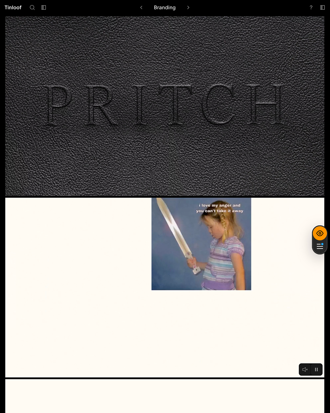
Deconstructing the PRITCH Identity
Context If you want to jump straight into how we created the Omnist brand identity, skip this section - it explains the product’s landscape and what kind of solution Omnist aims to provide.
Martin Taylor and others
3 min